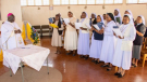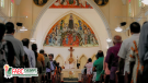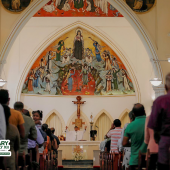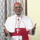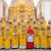


The Great Pilgrimage of Hope (GPH), the landmark continental gathering of the Federation of Asian Bishops’ Conferences (FABC), will take place in Penang, Malaysia, from November 27–30. Thousands of delegates, bishops, clergy, religious, lay leaders, youth, and representatives from across Asia will come together to celebrate faith, reflect on mission, and rekindle Christian hope for the region.
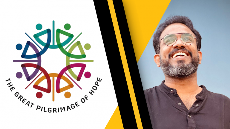
A key visual identity for this historic event is the newly crafted GPH Logo, an image that captures the spirit, culture, and mission of the Asian Church. Designed by renowned Indian art director Sanil Augustine, the logo embodies the themes of hope, togetherness, Gospel witness, and community, the very heart of the Great Pilgrimage of Hope.
The Art of Hope — Meaning and Vision Behind the GPH Logo
When thousands of pilgrims gather in Penang this November for the Great Pilgrimage of Hope, one symbol will accompany them everywhere, on banners, T-shirts, badges, and across digital platforms. It is the vibrant, contemporary GPH Logo, a design that has already become an emblem of unity for the Church in Asia.
Behind this striking visual identity stands Sanil Augustine, an Indian creative director based in Kerala, whose career spans more than two decades in design, marketing, and communication. A founder-director of Popkon Creatives and an active lay leader in his parish community, Sanil brings together professional excellence, cultural sensitivity, and faith commitment, qualities that shaped every detail of the GPH emblem.
A Vision Rooted in the Brief: Simple, Memorable, Asian
When Sanil first received the design brief from the organizers, the expectations were clear:
• “Memorable… Simple… Aesthetically interesting… Contemporary… Asian flavour.”
• “Hope & Togetherness… in the context of journeying together in Asia.”
These statements became the backbone of his creative exploration. The challenge was to translate the vast and varied reality of the Asian Church, its cultures, colours, spiritualities, and struggles, into a visual expression that is both modern and symbolic.
Sanil’s response was a logo that feels unmistakably Asian, globally contemporary, and spiritually uplifting.
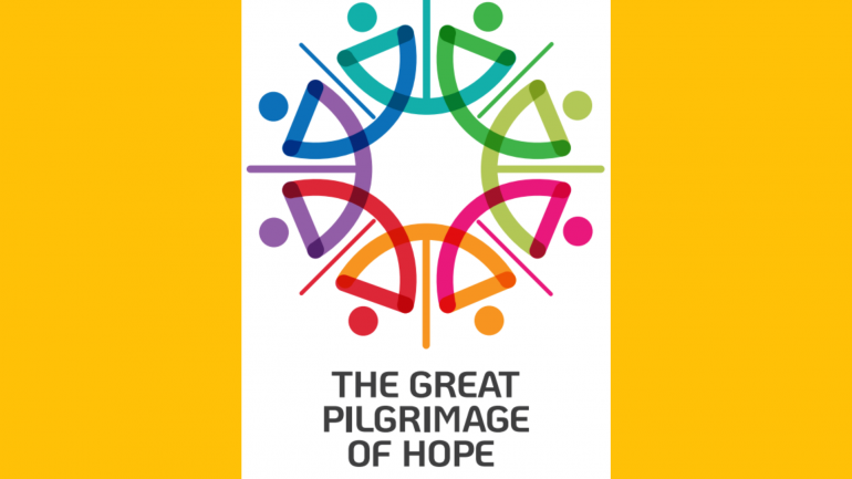
Colours That Speak Asia
One of the first elements that stands out is the colour palette. Sanil deliberately chose vibrant Asian colours inspired by the region’s festivals, textiles, and natural landscapes. These hues bring warmth, joy, and energy to the logo, qualities deeply connected to hope.
The colours also give the design immense flexibility. Whether on T-shirts, caps, badges, eco-bags, or large outdoor displays, the graphic identity adapts beautifully.
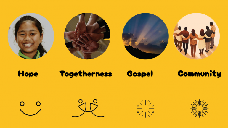
Four Themes Woven Into a Single Form
The brilliance of the logo lies in how its simple shapes carry profound meaning. Sanil crafted the design around four interwoven themes, all central to the Great Pilgrimage of Hope.
-
Hope — Smiles
Soft, curved shapes resemble joyful, smiling faces. Hope is not abstract here; it is visible, human, and shared.
-
Togetherness — Intertwined Hands
The figures appear joined, symbolizing hands reaching out to one another. This sense of connection reflects the unity and solidarity of the Asian Church.
-
Gospel — Radiating Light
Elegant lines extend outward from the centre, evoking light that spreads and illuminates, the Light of the Gospel entrusted to the Church in Asia.
-
Community — A Circular Pilgrim Church
All elements come together in a circular composition, representing the Asian Church as a pilgrim community, diverse yet united, moving forward in faith.

A Logo That Extends Into Life
Beyond its symbolic depth, the design is practical and versatile. The colours and forms translate well into a wide range of collateral items, from shirts and caps to signage, digital banners, and pilgrim kits. The identity is scalable, recognizable, and emotionally engaging.
As thousands of participants walk together in Penang, the logo becomes a shared visual language, one that mirrors the journey of faith, unity, and hope they undertake.
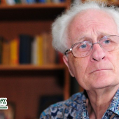
Sanil Speaks: Finding God Through Creativity
Speaking to Radio Veritas Asia, Sanil expressed deep gratitude and joy:
“When I heard that the FABC Office of Evangelization had accepted my logo, I felt humbled and grateful. For me, design is not just work, it is where I meet God. In every colour, curve, and idea, I look for His presence. My creative journey gives me meaning because it becomes a way of expressing my faith and serving the Church through the gifts He has given me.”
His words reveal a spirituality woven into his craft, a way of discovering God in the dialogue between imagination and service.
A Symbol for a Pilgrim Continent
The Great Pilgrimage of Hope is more than an event. It is a call to renew faith, rediscover community, and carry the light of the Gospel into Asia’s diverse realities.
Through the thoughtful work of designer Sanil Augustine, the GPH logo becomes a symbol of that mission, colourful, culturally rooted, contemporary, and filled with meaning. It reminds every pilgrim: we walk together, as one Asian Church, bearing hope for our continent.
Radio Veritas Asia (RVA), a media platform of the Catholic Church, aims to share Christ. RVA started in 1969 as a continental Catholic radio station to serve Asian countries in their respective local language, thus earning the tag “the Voice of Asian Christianity.” Responding to the emerging context, RVA embraced media platforms to connect with the global Asian audience via its 21 language websites and various social media platforms.
Latest News